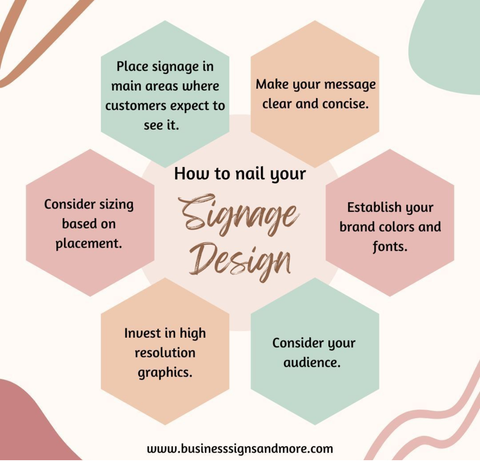
In today's bustling world, where attention is a scarce commodity, effective signage design can make all the difference between being noticed or getting lost in the crowd. From storefronts to trade shows, from billboards to menus, the impact of well-crafted signage cannot be overstated. In this blog post, we'll delve into the essential elements of nailing your signage design, drawing insights from industry experts and proven practices.
-
Clarity is Key: The foremost principle of effective signage design is clarity. Your message should be instantly comprehensible to anyone passing by. Keep it concise, using clear and legible fonts. Avoid clutter and unnecessary information that can dilute your message.
-
Hierarchy of Information: Establish a clear hierarchy in your signage to guide viewers' attention. Important information should be prominent and easily visible, while secondary details can be presented with less emphasis. This helps viewers quickly grasp the most crucial aspects of your message.
-
Brand Consistency: Your signage is an extension of your brand identity. Ensure consistency in colors, fonts, and visual elements to reinforce brand recognition. Consistent branding across all your signage builds trust and strengthens brand recall among your target audience.
-
Visibility and Readability: Consider the viewing distance and angle when designing your signage. Ensure that text and graphics are large enough to be legible from a distance, and choose colors that contrast well for optimal visibility. Test your design in various lighting conditions to ensure readability in different environments.
-
Whitespace and Balance: Don't underestimate the power of whitespace in your signage design. It helps to create breathing room and enhances readability. Balance is also crucial; distribute elements evenly across the signage to maintain visual harmon
-
Call to Action: Every effective signage design should include a clear call to action. Whether it's prompting customers to visit your store, inquire about a product, or take advantage of a special offer, a compelling call to action motivates viewers to act upon seeing your signage.
-
Versatility and Adaptability: Design your signage with versatility in mind. It should be adaptable to different sizes, formats, and locations without compromising its effectiveness. This ensures consistency in your brand message across various touchpoints.
-
Audience-Centric Approach: Understand your target audience and tailor your signage design to resonate with their preferences and needs. Use language, imagery, and messaging that speaks directly to your audience's interests and pain points.
-
Testing and Iteration: Don't be afraid to test different signage designs and iterate based on feedback and data. Conduct A/B testing to compare the effectiveness of different designs and refine your approach accordingly.
-
Stay Updated: Finally, stay abreast of emerging trends and innovations in signage design. The landscape is constantly evolving, with new technologies and techniques shaping the way we create and interact with signage. By staying updated, you can ensure that your signage remains relevant and impactful in a dynamic market.
Mastering signage design requires a thoughtful blend of creativity, strategy, and execution. By focusing on clarity, consistency, visibility, and audience relevance, you can create signage that captures attention, communicates effectively, and drives desired actions. Business Signs & More offers complimentary design services and our design team will work with you to bring your vision to life!
Do you have questions about signage design? We're here to help!

